Maps
1 Required Skills & Software
- GIS
- Python
- Gitlab
2 How to start
There are two ways to incorporate a map in MoLöwe.
If your GIS file (e.g. shapefile) is…
- smaller than 45 Mb: use Mapbox
- bigger than 45 Mb: create a map locally in a GIS and load it as an image file (either from the MoLöwe-Server or from Git-repo) into MoLöwe
You can copy/paste the given python codes in your notebook and adjust them to your needs. However, you must import the following modules in your notebook first:
import pandas as pd
import geopandas as gpd

import plotly.express as px
import plotly.graph_objects as go
Also, you need to define a mapbox token at the beginning of your notebook, such as:
mapbox_access_token = "pk.eyJ1IjoibW9sb2V3ZSIsImEiOiJjanprMzFkODUwMnJyM29vM3lwYWNwMG5jIn0.ElIGswv7z_KNHyivxm9yrg"
3 Mapbox
3.1 Using Mapbox
All GIS processing and plotting is happening “from scratch” each time you access the slide (using the files imported to the MoLöwe-Server for the project).
Pros
- interactivity: you can freely zoom, navigate and turn off elements in the map
- hovertext
- wide range of basemaps to ease orientation
Cons
- difficulties loading larger file sizes
- plotting time depends on amount of data points: plotting large amount of data points will take a while
In order to use shape files in your maps, you must import the shape files with all of their extensions to the MoLöwe-Server. Supported formats on the Server are .shp, .shx, .prj and .dbf (cpg-files are not supported).
3.2 Scatter Plot
Mapbox Scatter plots can be built from either a coordinate table (long & lat) or from a point shape file.
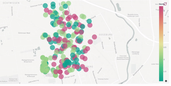
Example
Each dot is a tree, the color representing its health aka. its “score”. Hovering over a tree will show its coordinates and description of health (”excellent”, “good” or “unfit”). The source data is a point shapefile previously uploaded to the MoLöwe-Server (using a coordinate table would also be possible, see python code below).
Source Data (Sample)
| lat | lon | text | score |
|---|---|---|---|
| 53.2645 | 10.3985 | excellent | 1 |
| 53.2646 | 103.985 | excellent | 1 |
| 53.2634 | 10.3981 | good | 2 |
| 53.2647 | 10.3981 | unfit | 4 |
Python Code
def get_tree_map(self):

  # load point shapefile (from the MoLöwe-Server) as geodataframe
  trees = gpd.read_file(data + "trees.shp")
  # Note: The EPSG of the example data is 4326

  # The EPSG of your data must be 4326 to work in mapbox. If it's not, you could re-project it:
  # trees = trees.to_crs(epsg=4326)
  # Since the EPSG of the example data is already in 4326, we don't need to re-project it

  # You can also generate a geodataframe from a coordinate table:
  # trees = pd.read_csv(text + "trees.txt", sep=";")
  # trees = gpd.GeoDataFrame(trees, crs="EPSG:4326", geometry=gpd.points_from_xy(trees.lon, trees.lat))
  # Note: The second argument is the EPSG of the data. If it's not already 4326, you must re-project it (see above)


  # plot
  fig = px.scatter_mapbox(data_frame=trees,
                          lat="lat",
                          lon="lon",
                          color="score",
                          opacity=0.7,
                          color_continuous_scale="temps",
                          mapbox_style="carto-positron",
                          zoom=14,
                          center={"lat": 53.268039, "lon": 10.403832})

  # set a fixed marker size
  fig.update_traces(marker={'size': 38})

  my_config = dict()

  return my_chart.moloewe_chart_plot(plotly_data = fig.to_dict(), plotly_config = my_config)

setattr(tool_map, "get_treemap", get_treemap)
3.3 Scatter Plot with Dropdown List
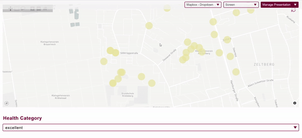
Example
Same as in previous example, however, now we can restrict the map to trees that belong to a certain health category (”excellent”, “good” or “unfit”) using a dropdown list. Hovering over a tree will show its coordinates and score.
Note: After making a selection in the dropdown list, the map must be refreshed (in the upper right corner of the map) to apply the changes.
Source Data (Sample)
(same as in previous example)
| lat | lon | text | score |
|---|---|---|---|
| 53.2645 | 10.3985 | excellent | 1 |
| 53.2646 | 103.985 | excellent | 1 |
| 53.2634 | 10.3981 | good | 2 |
| 53.2647 | 10.3981 | unfit | 4 |
Python Code
Dropdown List Functions
# define default dropdown.md selection
trees_health = "excellent"


def get_tree_dropdown(self):
    return {
        "values": ["excellent", "good", "unfit"],
        "default": trees_health,
    }

setattr(tool_dropdown, "get_tree_dropdown", get_tree_dropdown)


def set_tree_dropdown(self, dropdown_selection):
    global trees_health
    trees_health = dropdown_selection

setattr(tool_dropdown, "set_tree_dropdown", set_tree_dropdown)
Map Function
def get_tree_dropdown_map(self):

  # Note:
  # - This is mostly the same code as for the first scatter plot example,
  #   the only difference here is that we first select the trees that fall
  #   into the selected health category
  # - also, the hovertext will now show the score

  # load point shapefile (from the MoLöwe-Server) as geodataframe
  trees = gpd.read_file(data + "trees.shp")
  # Note: The EPSG of the example data is 4326

  # The EPSG of your data must be 4326 to work in mapbox. If it's not, you could re-project it:
  # trees = trees.to_crs(epsg=4326)
  # Since the EPSG of the example data is already in 4326, we don't need to re-project it

  # You can also generate a geodataframe from a coordinate table:
  # trees = pd.read_csv(text + "trees.txt", sep=";")
  # trees = gpd.GeoDataFrame(trees, crs="EPSG:4326", geometry=gpd.points_from_xy(trees.lon, trees.lat))
  # Note: The second argument is the EPSG of the data. If it's not already 4326, you must re-project it (see above)

  # select the trees that fall into the selected health category
  trees = trees[trees["text"] == trees_health]

  # plot
  fig = px.scatter_mapbox(data_frame=trees,
                          lat="lat",
                          lon="lon",
                          color="score",
                          opacity=0.7,
                          color_continuous_scale="temps",
                          mapbox_style="carto-positron",
                          zoom=14,
                          center={"lat": 53.268039, "lon": 10.403832})

  # set a fixed marker size
  fig.update_traces(marker={'size': 38})

  my_config = dict()

  return my_chart.moloewe_chart_plot(plotly_data = fig.to_dict(), plotly_config = my_config)

setattr(tool_map, "get_tree_dropdown_map", get_tree_dropdown_map)
3.4 Choropleth Map - Continuous Color Scale
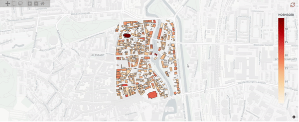
Example
Buildings are colored according to their height. The source data is a shape file (imported to the MoLöwe-Server). Hovering over a building will show its index in the shape file and its height (”HOEHEGEB”). A continuous color scale is used.
Source Data (Sample)
- "HOEHEGEB": Building heights
- "DACHFORM": Roof shapes (not relevant in this example)
| HOEHEGEB | DACHFORM |
|---|---|
| 14.2 | flat |
| 12.0 | gable |
| 34.2 | gable |
| 18.6 | shed |
Python Code
def get_buildings_continuous_map(self):

  # load shapefile (from the MoLöwe-Server) as geodataframe
  buildings = gpd.read_file(data + "buildings.shp")
  # Note: The EPSG of the example data is 25832

  # re-project to EPSG 4326 (for mapbox)
  buildings = buildings.to_crs(epsg=4326)

  # plot
  fig = px.choropleth_mapbox(data_frame=buildings,
                              geojson=buildings.geometry,
                              locations=buildings.index,
                              mapbox_style="carto-positron",
                              color="HOEHEGEB",
                              color_continuous_scale="OrRd",
                              zoom=15,
                              center={"lat": 53.250, "lon": 10.411})

  my_config = dict()

  return my_chart.moloewe_chart_plot(plotly_data = fig.to_dict(), plotly_config = my_config)

setattr(tool_map, "get_buildings_continuous_map", get_buildings_continuous_map)
3.5 Choropleth Map - Discrete Color Scale
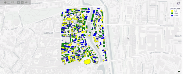
Example
Same as in previous example, however, now the buildings are colored according to their roof shape (”flat”, “gable”, “shed”) using a discreet (i.e. categorical) color scale.
Source Data (Sample)
(same as in previous example)
| HOEHEGEB | DACHFORM |
|---|---|
| 14.2 | flat |
| 12.0 | gable |
| 34.2 | gable |
| 18.6 | shed |
Python Code
def get_buildings_discreet_map(self):

  # load shapefile (from the MoLöwe-Server) as geodataframe
  buildings = gpd.read_file(data + "buildings.shp")
  # Note: The EPSG of the example data is 25832

  # re-project to EPSG 4326 (for mapbox)
  buildings = buildings.to_crs(epsg=4326)

  colors = {"gable": "blue",
            "shed": "green",
            "flat": "yellow"}

  # plot
  fig = px.choropleth_mapbox(data_frame=buildings,
                              geojson=buildings.geometry,
                              locations=buildings.index,
                              mapbox_style="carto-positron",
                              color="DACHFORM",
                              color_discrete_map=colors,
                              zoom=15,
                              center={"lat": 53.250, "lon": 10.411})

  my_config = dict()

  return my_chart.moloewe_chart_plot(plotly_data = fig.to_dict(), plotly_config = my_config)

setattr(tool_map, "get_buildings_discreet_map", get_buildings_discreet_map)
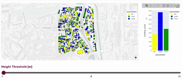
3.6 Choropleth Map - Discrete Color Scale with Slider and Barchart
Example
Same as in previous example, however, now we have a slider where we choose a height threshold. Buildings whose heights fall below this threshold are removed from the map. In addition, a bar chart next to the map shows the amount of remaining buildings grouped by roof shape.
Note: After selecting a new value on the slider, the map must be refreshed (in the upper right corner of the map) to apply the changes. The same goes for the bar chart.
Source Data (Sample)
(same as in previous example)
| HOEHEGEB | DACHFORM |
|---|---|
| 14.2 | flat |
| 12.0 | gable |
| 34.2 | gable |
| 18.6 | shed |
Python Code
Slider Functions
# define default slider value
buildings_height = 0

def get_buildings_height(self):
  return {
      "Minimum": 0,
      "Maximum": 35,
      "Step": 1,
      "Default": buildings_height,
  }

setattr(tool_slider, "get_buildings_height", get_buildings_height)

def set_buildings_height(self, slider_selection):
  global buildings_height
  buildings_height = float(slider_selection)

setattr(tool_slider, "set_buildings_height", set_buildings_height)
Map Function
def get_buildings_slider_map(self):

  # load shapefile (from the MoLöwe-Server) as geodataframe
  buildings = gpd.read_file(data + "buildings.shp")
  # Note: The EPSG of the example data is 25832

  # re-project to EPSG 4326 (for mapbox)
  buildings = buildings.to_crs(epsg=4326)

  # select buildings whose height is above the selected threshold
  buildings_subset = buildings[buildings["HOEHEGEB"] > buildings_height]

  colors = {"gable": "blue",
            "shed": "green",
            "flat": "yellow"}

  # plot
  fig = px.choropleth_mapbox(data_frame=buildings_subset,
                              geojson=buildings_subset.geometry,
                              locations=buildings_subset.index,
                              mapbox_style="carto-positron",
                              color="DACHFORM",
                              color_discrete_map=colors,
                              zoom=15,
                              center={"lat": 53.250, "lon": 10.411})

  my_config = dict()

  return my_chart.moloewe_chart_plot(plotly_data = fig.to_dict(), plotly_config = my_config)

setattr(tool_map, "get_buildings_slider_map", get_buildings_slider_map)
Bar Chart Function
def get_buildings_slider_barchart(self):

  # load shapefile (from the MoLöwe-Server) as geodataframe
  buildings = gpd.read_file(data + "buildings.shp")

  # filter out buildings
  buildings_subset = buildings[buildings["HOEHEGEB"] > buildings_height]

  colors = {"gable": "blue",
            "shed": "green",
            "flat": "yellow"}

  # group building subset by roof shape and get count of each group
  df = buildings_subset.groupby('DACHFORM').size().reset_index(name='building_count')

  fig = px.bar(df,
                x='DACHFORM',
                y='building_count',
                color="DACHFORM",
                color_discrete_map=colors)

  my_config = dict()

  return my_chart.moloewe_chart_plot(plotly_data = fig.to_dict(), plotly_config = my_config)

setattr(tool_graph, "get_buildings_slider_barchart", get_buildings_slider_barchart)
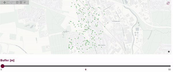
3.7 Generating New Polygons
Example
So far, we generated our polygons beforehand (i.e. in a GIS) and imported them into the MoLöwe-Server to use them in Mapbox. We can also generate new polygons within Mapbox.
In this example we are generating buffers around trees. The buffer size is defined by the slider input. Each time a new value is selected on the slider, new buffers are generated and then displayed in the map.
Note: After selecting a new value on the slider, the map must be refreshed (in the upper right corner of the map) to apply the changes.
Source Data (Sample)
(same as example “Scatter Plot”)
| lat | lon | text | score |
|---|---|---|---|
| 53.2645 | 10.3985 | excellent | 1 |
| 53.2646 | 103.985 | excellent | 1 |
| 53.2634 | 10.3981 | good | 2 |
| 53.2647 | 10.3981 | unfit | 4 |
Python Code
Slider Functions
# define default slider value
trees_buffer = 0

def get_tree_buffer(self):
  return {
      "Minimum": 0,
      "Maximum": 50,
      "Step": 1,
      "Default": trees_buffer,
  }

setattr(tool_slider, "get_tree_buffer", get_tree_buffer)

def set_tree_buffer(self, slider_selection):
  global trees_buffer
  trees_buffer = float(slider_selection)

setattr(tool_slider, "set_tree_buffer", set_tree_buffer)
Map Function
def get_trees_buffer_map(self):

  # load point shapefile (from the MoLöwe-Server) as geodataframe
  trees = gpd.read_file(data + "trees.shp")
  # Note: The EPSG of the example data is 4326

  # create buffer
  trees = trees.to_crs(epsg=25832) # we need to re-project "trees" to a projected CRS to get correct buffers
  buff = gpd.GeoDataFrame(geometry=trees.buffer(trees_buffer))
  buff["category"] = "buffer"
  buff = buff.dissolve(by="category")

  # plot trees
  trees = trees.to_crs(epsg=4326)
  fig = px.scatter_mapbox(data_frame=trees,
                          lat="lat",
                          lon="lon",
                          mapbox_style="carto-positron",
                          zoom=14,
                          center={"lat": 53.268039, "lon": 10.403832})

  # set fixed color for the trees:
  fig.update_traces(marker={'color': "forestgreen"})

  # You can set a fixed marker size for the trees:
  # fig.update_traces(marker={'size': 38})

  # plot buffer
  buff = buff.to_crs(epsg=4326)
  buff["category"] = "buffer"
  fig_buff = px.choropleth_mapbox(data_frame=buff,
                                  geojson=buff.geometry,
                                  locations=buff.index,
                                  color="category",
                                  color_discrete_map={'buffer': 'green'},
                                  opacity=0.5)

  fig_buff.update_traces(marker_line_width=0)

  # merge both plots into one
  if trees_buffer > 0:
      fig.add_trace(fig_buff.data[0])

  my_config = dict()

  return my_chart.moloewe_chart_plot(plotly_data = fig.to_dict(), plotly_config = my_config)

setattr(tool_map, "get_trees_buffer_map", get_trees_buffer_map)